Table of Contents
- Step 1: Set Up Your Looker Studio Account
- Step 2: Connect Your Data Sources
- Connect DAXRM CRM
- Blending Data
- Step 3: Build Your First Dashboard
- Choose Your Visualizations
- Customize Charts
- Step 4: Design and Layout
- Sketch Your Layout
- Use Themes and Branding
- Step 5: Add Interactivity
- Add Filters
- Drill-Down Features
- Step 6: Refining and Automating Your Reports
- Blended Data Reports
- Adding Calculated Fields
- Automated Reports
- Step 7: Sharing and Collaboration
- Sharing Your Dashboard
- Embed or Export
- Step 8: Testing and Optimizing
- The Way Forward
Looker Studio (formerly Google Data Studio) is a dynamic, user-friendly data visualization tool that lets you transform dry, boring data into interesting and interactive reports and dashboards. Whether you're managing customer interactions or just tracking various marketing KPIs, Looker Studio can simplify how you analyze, visualize, and share data insights. Did you know? In client reporting, data visualization can make raw data up to 70% more comprehensible and three times more likely to be acted upon.

In this concise yet comprehensive guide, we’ll walk you through the entire process of tapping into the power of Looker Studio for your business or agency. Ready to turn raw data into meaningful insights? Let’s dive in!
Step 1: Set Up Your Looker Studio Account
Getting Started
- Head over to Looker Studio.
- Sign in using your Google account. If you use other Google tools (e.g., Analytics, Ads), your data sources will be readily available.
Create a New Report
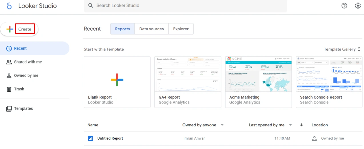
- Once logged in, click the "Create" button and choose "Report".
- You’ll land on a blank canvas where you can start crafting your dashboard.
Pro Tip: Organize your datasets (Google Analytics, CRM, Sheets, etc.) beforehand to speed up the integration process.

Step 2: Connect Your Data Sources
Add Data Source
- Looker Studio supports 24 Google connectors and more than 1,000 partner connectors including:
-
- Google Sheets
- Google Analytics
- Search Console
- YouTube Analytics
- BigQuery
- Shopify, and
- DAXRM
2. Click "Data Sources" in the toolbar and click “Create new data source”.
3. Select your data source from the list of available integrations and authorize the sources that you want to use.

Connect DAXRM CRM
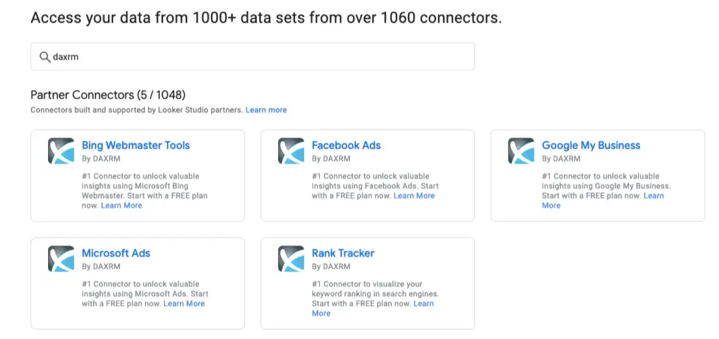
- Search for DAXRM in the data sources search bar.
- Authorize your DAXRM account to pull in key customer metrics from DAXRM.
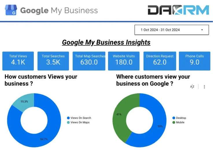
- Example: Connect your Google Business Profile data from DAXRM to visualize the increase in inquiries and store visits attributable to your marketing efforts.
Blending Data
Combine multiple data sources. For example, blend Google Analytics website traffic with CRM data to see how marketing campaigns translate into actual sales.
Step 3: Build Your First Dashboard
With your data connected, it’s time to build a dashboard that tells the story of your business.
Choose Your Visualizations
Looker Studio offers various visualizations like:
- Time Series: Ideal for showing trends over time, such as month-over-month sales.
- Bar Charts: Perfect for comparing performance across categories, like product sales by region.
- Scorecards: Highlight key metrics such as total revenue, customer growth, or acquisition rate.
Actionable Step: Click "Add a Chart", then drag and drop the chart onto your canvas. Once placed, you can select the dataset you want to visualize in that chart.
Customize Charts
- Select each chart and adjust settings (axis labels, colors, fonts) to ensure the data is easy to interpret.
- Example: Add a filter for sales reps so users can toggle performance data by individual team members.
- Pro Tip: Stick with 2-3 key visual types in your report to keep it focused and readable. Consider starting with scorecards, line charts, and bar charts
Step 4: Design and Layout
A well-designed dashboard makes it easier for stakeholders to quickly grasp insights.

Sketch Your Layout
- Organize information from top to bottom or left to right, focusing on key metrics at the top.
- Divide your dashboard into sections using headers or shapes.
Use Themes and Branding
- Looker Studio offers both pre-made templates and themes and the ability to create custom ones.
- Apply themes to match your brand’s colors and fonts, giving a professional look.
- Actionable Step: Under "Theme and Layout", explore themes or create your custom color palette to align the dashboard with your company’s branding.
Step 5: Add Interactivity
The ability to interact with data is one of Looker Studio's strongest features.
Add Filters
Filters allow users to refine the data they see, giving them the flexibility to view specific segments such as date ranges, customer segments, or product categories. This ensures users can analyze data in a way that's most relevant to them without overwhelming them with unnecessary information. Example: Suppose you're tracking sales performance. Adding a date range filter enables users to examine sales trends by week, month, or year, helping them identify patterns and seasonal variations. Actionable Steps
- In the Looker Studio editor, go to the toolbar and select "Add a Control" > "Date Range Control".
- Drag and position the filter at the top of your dashboard, above the relevant charts.
- Customize the filter to allow users to select specific time frames for analysis, ensuring it applies to all relevant data points (e.g., revenue, customer interactions).
- Additional Tip: You can apply other types of filters like dropdown lists for customer segments or product categories to give users even more flexibility in interacting with the data.
Drill-Down Features
Drill-down functionality is an advanced feature that allows users to click on high-level data (like overall sales) and get more granular insights. For example, users can click on a total sales figure and drill down into region-wise sales or performance by individual sales reps. Example: If you display a bar chart showing total sales, drill-downs can let users click on a bar to reveal more detailed sales data, such as the performance of different regions, or even further drill down to sales rep performance within each region. Actionable Steps:
- Select the chart or graph where you want to enable drill-down functionality.
- In the Data panel on the right-hand side, check the box next to "Enable Drill-Down".
- Add the dimensions you'd like to drill down into. For instance, if you start with total sales by month, add "Region" and "Sales Rep" as drill-down dimensions.
- Now, when users click on the chart, they’ll be able to explore more detailed levels of the data.
Pro Tip: Use drill-down features to simplify complex reports, keeping top-level metrics visible while still allowing users to explore deeper insights as needed.
Step 6: Refining and Automating Your Reports
Blended Data Reports
Combine multiple datasets (Google Analytics + CRM) for comprehensive reports, allowing you to measure the true ROI of marketing campaigns.
Adding Calculated Fields
- Need a custom metric like conversion rate or lifetime customer value? Use calculated fields to create new data points based on your raw data.
- Actionable Step: Go to "Resource" > "Manage Added Data Sources" > "Create Field". Enter the formula for your custom metric.
Automated Reports
- Set your reports to update automatically and even schedule regular email reports to your team.
- Actionable Step: Click "Schedule Email Delivery" to automate reports, ensuring your stakeholders get updates without manually checking dashboards.
Step 7: Sharing and Collaboration
Now that your dashboard is ready, it’s time to share it.
Sharing Your Dashboard
Click the "Share" button at the top to set sharing permissions. You can allow viewers to either view or edit the report.
Embed or Export
You can embed Looker Studio reports in websites, or export them as PDFs. This feature is perfect for embedding dashboards in your internal DAXRM system for easy access to customer insights. Actionable Step: Click "File" > "Embed Report" to generate an embed code or "Download" to export the report as a PDF.
Step 8: Testing and Optimizing
Before sharing your report widely, it’s essential to test it.
- Testing Filters and Controls: Ensure all filters and drill-down options work as expected. Interact with every element in the report to guarantee accuracy.
- Optimize for Performance: If your dashboard includes complex datasets, test how quickly it loads. Optimize by reducing the number of charts or blending smaller data segments.
The Way Forward
Looker Studio is a powerful tool that allows you to simplify complex data into easy-to-read, interactive reports. It is designed for intuitiveness, so you can easily get started with this basic guide. Connect your data sources, visualize your dashboard, and start creating and sharing impressive data visualization on the fly. Get started today, and watch how data transforms the way you run your business.


